
KNIGHT’S LATE TRAIN
Time for another:
BOOK COVER CONTEST!
If you pick the most popular book cover from the selection below, you’ll be entered to win a box of Christopher Elbow Artisan Chocolates.

- And the winner is?
So which eBook cover for my next men’s action/adventure thriller novel best draws you in and makes you want to read the story? To be eligible to win, make your selection and post it in a comment at the bottom of this page (or by email) by July 13, 2012. The winner will be announced on this website on Saturday, July 14.
Click on the images below to see larger, more detailed slides:
-
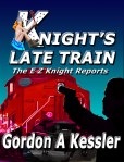
- #1 The original Knight’s Late Train Cover–too hokey?
-
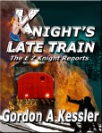
- #2 The NEW Knight’s Late Train cover! Due out this summer!
-

- #3 Or is this one more menacing, scary, and wild with the glowing, cherry-red-hot snowblower on front?
What do you think?
Is #1 too hokey looking?
Is #2 too overdone with the fire?
Is #3 unrealistic and way over the top with the cherry-red-hot snowblower stuck on the front end?
Please give me your selection, thoughts and comments by July 13, 2012 in order to be eligible to win a box of some really delicious Christopher Elbow Artisan Chocolates!


I like number 2. It’s a good mix of action and realism. I might say number 3, but I’m not sure people would recognize what the snowblower is.
Thanks for your vote, Patsy!
Gordon, I think #2 is a good mix of action and realism in a great color scheme without being overdone. I especially like the placement of EZ on the tracks in #2 and #3 more than placement in #1. Shows he isn’t afraid of placing himself in whatever danger he must in order to get the job done.
Thanks for your vote, Denise!
I like #2 the best .
Thank you Pat! Your vote and your opinion are importatnt to me!
Put me down for #2 because it looks like EZ is really having it out with that big ol burning locomotive and #3 looks like a big fan is on fire and EZ is getting blown over while trying to shoot the blades off of the thing. #1 looks like he is shooting at the Knight Girl and we just can not have that.
Thanks, Tom! I appreciate your comments!
I like #1. I just found you this morning, and when I saw the book covers, I was drawn to #1. I like the blue over the blue/green of the other two, and I thought the fire took away from the clean lines. As a thumbnail, the title stands out better on #1. I do like the position of EZ in #2 & #3 – turned away with the gun aimed behind him. (But I’m no artist, so I’m just piping up with what I like.)
I wanted to see what your books were about, so I “looked inside” Knight’s Big Easy. Love the opening. You’ll see a sale this morning; that was me. I don’t even have a Kindle; I have a Nook. I’ll have to finish reading it on the Kindle for PC, but am happy to do so. Thanks!
I like #1. It’s strong and simple in design and use of color…. red and black.
Thanks for your vote, Vicki!
I vote for #2, very appealing image, great action!
Thanks Charlie! I appreciate your vote! I think the story will live up to the cover! It’s been a blast to write. I’m hoping to have it out by the end of next month.
Jeremy L of Ft Worth, Texas, come on down! You are the winner of the Christopher Elbow Artisan Chocolates!